
Allison & Justin’s Wedding
Allison & Justin’s Wedding
Allison and Justin got married on beautiful summer day on Elihu Island, just off the coast of their hometown in Stonington, Connecticut. It was a dreamy day full of picture perfect details and sunshine, and the love between these two radiates in all of their photos.
Allison was involved with her stationery design from the moment we got in touch. We loved all of her ideas and had so much fun working with her to bring her vision to life!
 Photography by Ali + Julie
Save the Dates
Allison & Justin’s save the dates were the first item guests received to set the tone of their wedding. We usually suggest clients use their save the dates as a place to be playful and have fun, since these pieces don’t need to be as formal or convey as much information as invitations. Allison was excited to showcase their beautiful engagement photos (taken by Krush Graphics), so we created a photo “collage” to include a few. Justin works for Amtrak, so their photos at the railroad crossing by Elihu Island were not only beautiful, but also touchingly sweet and meaningful.


Invitation Suite
Allison had a vision of the colorful peonies she was including in her floral arrangements, and was excited to feature them in her invitation suite design. Along with the florals, we incorporated a gold geometric element woven throughout each of the pieces. Paired with the same playful yet elegant typeface we used on her save the date, the invitation design came together.

As a special touch, the invitation suite incorporated an insert with the history and map of Elihu Island, along with a personal note on why the couple chose that location for their wedding. Everything was pulled together with a custom belly band for the pieces to stay together in their envelope. The florals were even carried through to custom postage stamps affixed to the outside. See, we told you the details for this wedding were on point!


Day of Details
The beautifully set tables covered in peony-filled flower arrangements brought the entire reception tent to life. We carried through the design elements from the invitation suite to create the menu, which was tied together with our hand lettered place card tags and set on each plate. Allison also DIY embossed tags with their wedding hashtag to complete the look.


There were geometric pieces throughout, including the gorgeous hanging lanterns that the bride’s grandfather (Voo) helped make. We love that aspects of the invitation design were mimicked in so many elements of the reception. The large format seating chart we designed sat within an ornate gold framed and was adorned with greenery. Can you think of a more beautiful way to help guests find their tables?


Using the map of Elihu Island we drew for the invitation suite, we created an image for Allison to have printed on tote bags. We love how the white on navy pops on these beauties screen printed by Poor Morgan.


We loved being part of this creative, love-filled celebration. Scroll on to see photos of Allison & Justin at their wedding!
Vendors
Photography – Ali + Julie
Planning & Coordination – Ruffles & Tweed
Florals – Stems Flower Design
Venue – Island Farm at Elihu Island
Beauty – Jennie Fresa Beauty and Posh Salon
Catering – Gourmet Galley Catering and Vesta Bakery
Stationery – We’re Into It


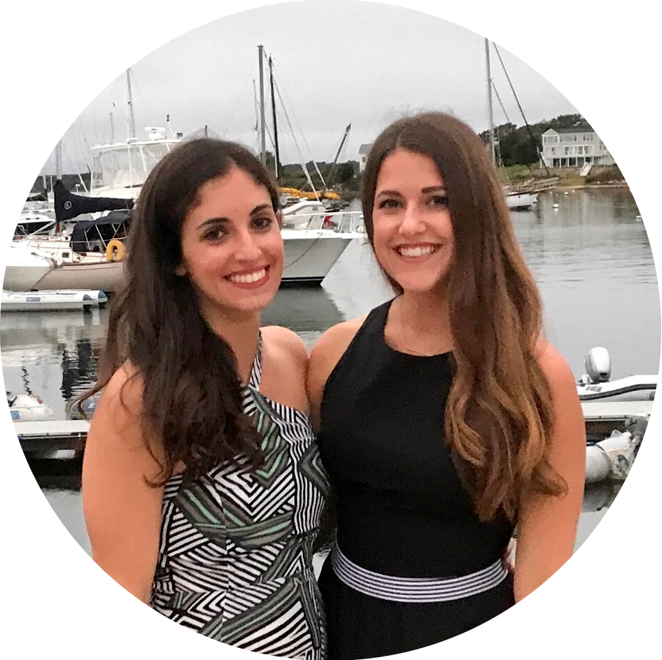
Welcome! We’re Amelia & Natasha and we’re into it
We love hand lettering and graphic design and we’re here to share some of our favorite things!
![]()
![]()
![]()
![]()
@Were_Into_It on Instagram


Error: The account for needs to be reconnected.
Due to recent Instagram platform changes this Instagram account needs to be reconnected in order to continue updating. Reconnect on plugin Settings page
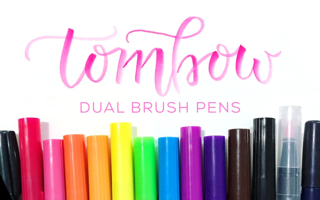


 The pens will also blend quite easily on top of paper. Start drawing with one color, and then layer over another. The lighter colored brush tips will pick up the darker colors and carry the color through as you continue to write. Another tactic is to write with two different colors touching, but not layered, and use the clear blender pen to combine the two. The blending possibilities are really quite varied. Just be careful – too many layers of ink can start to break apart the paper fibers!
